

What is Kutuki?
Kutuki is an ed-tech startup building for the young India by creating meaningful learning experiences that address the needs of Indian preschoolers. They provide a mobile learning app experience where kids can discover learning and entertainment content.
Why the re-design?
Kutuki was rapidly growing, but its user experience was lagging behind. To address this, we embarked on a redesign motivated by their user feedback and extensive market research. The goal was to streamline navigation, enhance content discovery, and create a more visually appealing and intuitive interface.
Kutuki caters to two key stakeholders: the 2-7-year-old children who are the primary users, and their parents, who are the decision-makers. The young users, many of whom are just starting their educational journey, are eager to explore and learn.
I conducted interviews with parents and some kids to understand the learning patterns of the users and the user experience of the existing Kutuki mobile App.

Here are some key insights that guided my design process:
I conducted a usability test and user survey to understand the challenges in the current application design and user experience.

What works?
What doesn't?
I discovered and defined four design goals which would shape the re-designed user experience. This took into consideration user and business requirements.
Kid first design
Redesign the app navigation to be kid-first by incorporating relevant UX principles and elements from real life.
Interactive activities
Ideate on simple games and interactive activities as an extension of Kutuki lessons.
World building
Incorporate the idea of Kutuki world as part of the app experience by use of inclusive language, characters and visuals.
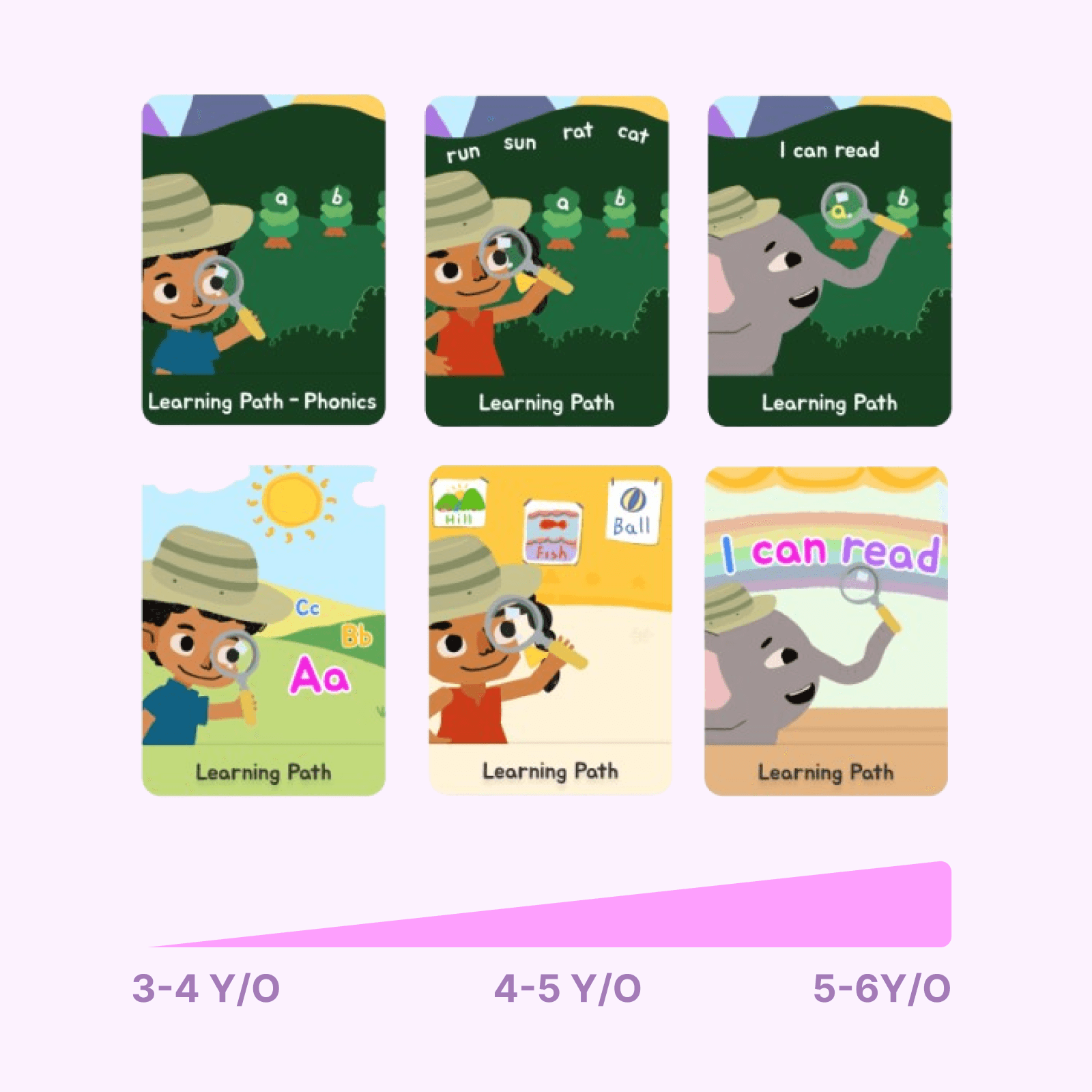
Learning as a journey
Explore non flat learning path as part of the learning curriculum.

VISUAL DESIGN
MODULE DESIGN
DISCOVERY
CANVAS


TROUBLESHOOTING
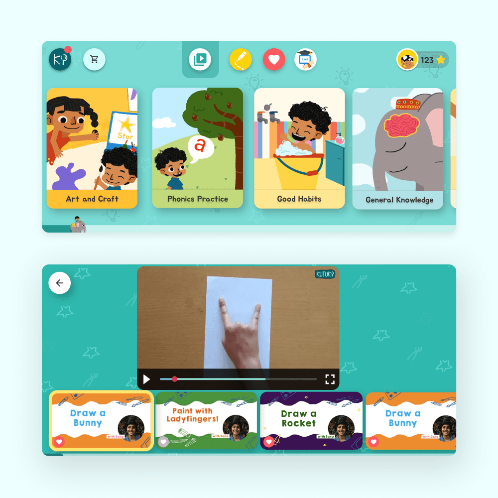
I worked on creating concepts for interactive games and quizzes that seamlessly extend the lesson with personalized content based on each child's preferences. The user-friendly interface uses real-world associations and avoids complex icons, ensuring an intuitive and immersive learning experience that aligns with the lesson narrative.

Design Impact
The project focused on best practices in children’s digital design, aligning with young users’ learning models and creating a more intuitive experience and standardising the design language of the brand. This redesign significantly boosted app engagement, with users and parents describing the new interface as ‘eye-catching,’ ‘easy to use,’ and ‘fun for children.’
My Takeaways
Working in a start-up environment taught me to balance user-centered design with business objectives, finding a productive intersection between UX and strategic goals.
Designing for children, with parents as decision-makers, was a unique challenge. I learned to reduce adult biases and adapt research methods, using parent-focused questionnaires to gain insights into children’s needs while maintaining an authentic user experience.